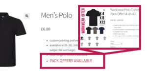
So, you’ve read the bit about ‘vector logos’ or ‘vector artwork’ (see Artwork) and are now wondering what we’re talking about. Let me explain. Vector artwork is basically comprised of maths, and can be scaled to any size without any reduction of quality. Raster artwork is comprised of pixels and will look correct at it’s 100% (or smaller) size. As you increase the size the quality will degrade as the pixels become apparent. To illustrate this here’s our logo.
Our logo as a raster:
First up a nice clean solid jpeg of the Tyneside T-shirts text part only. It’s made from an eps of the logo. Nice clean lines at 300px wide, 72dpi, save-for-web file. This image has been compressed slightly to give optimum look for file size to keep the page size on the server down as far as possible.
![]()
Next up is this image zoomed in 200%, note the lines not looking to clever now. Starting to blur, not as sharp and clean. Now if we were running this through our software to create plot lines for vinyl for t-shirts or signs you can see where we would start to be getting problems.
![]()
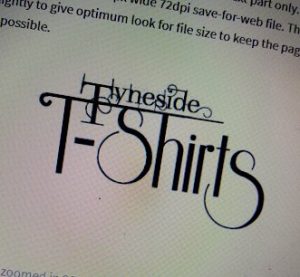
Now if we zoom in to 400% we get this.![]()
You can now see the pixelation quite clearly. It might look alright if you stand 3 metres back from the screen but still not great. Again, running this through for vinyl would result in square steps instead of nice smooth curves.
Our logo as a vector:
Now, here’s a screen shot of the eps zoomed in 800%.![]()
As you can see still nice and sharp, crisp clean lines (as much as a screen shot of it will let me). Perfect plot lines would result from this, at any size.
Another advantage in having vector images is that it makes it easier for editing. Why would I want my artwork editing? I hear you say. Well, if we were digitising your logo for embroidery and some of the detail was not showing properly, if at all, we’d recommend some edits to get the best results. Sometimes we need to thicken lines, elongate sections, all without losing the identity of the logo but necessary to get the best finished piece.
So you can see why we want vectors, giving us screen shot or photos of pc screens really isn’t going to get the best results.
Perhaps some moving pictures can say more than a few words…